
In the evolving landscape of data analysis, descriptive statistics remain a fundamental tool for summarizing and understanding data. As we move through 2024, the techniques and applications of descriptive statistics are increasingly critical in navigating the vast amounts of information available. This article delves into the essential techniques of descriptive statistics, exploring how they can be effectively applied for data analysis and visualization in the current year.
Understanding Descriptive Statistics
Descriptive statistics are methods used to summarize or describe the main features of a dataset. Unlike inferential statistics, which make predictions or inferences about a population based on a sample, descriptive statistics provide a clear and concise overview of the dataset at hand. These techniques help in organizing, presenting, and interpreting data in a meaningful way.
Key Techniques in Descriptive Statistics
1. Measures of Central Tendency
Measures of central tendency describe the center point of a dataset. The three most common measures are:
- Mean: The arithmetic average of all data points. It is calculated by summing all values and dividing by the number of values. The mean provides a central value for the dataset but can be affected by outliers.
- Median: The middle value when the data is sorted in ascending or descending order. For an even number of observations, it is the average of the two middle values. The median is particularly useful when dealing with skewed distributions or outliers.
- Mode: The value that occurs most frequently in the dataset. There can be more than one mode if multiple values have the same highest frequency. The mode is useful for categorical data or for understanding the most common value in a dataset.
2. Measures of Variability
Measures of variability describe the spread or dispersion of data points. Key measures include:
- Range: The difference between the maximum and minimum values in the dataset. The range gives a quick sense of the extent of variation but is sensitive to outliers.
- Variance: The average of the squared differences between each data point and the mean. Variance provides a measure of how much the data points deviate from the mean but is in squared units of the original data.
- Standard Deviation: The square root of the variance. It expresses the dispersion of data points in the same units as the original data, making it easier to interpret. A higher standard deviation indicates greater variability.
3. Percentiles and Quartiles
Percentiles divide the dataset into 100 equal parts, providing insights into the relative standing of a value within the dataset. Key percentiles include:
- Quartiles: Divide the data into four equal parts. The first quartile (Q1) represents the 25th percentile, the second quartile (Q2) is the median (50th percentile), and the third quartile (Q3) is the 75th percentile. Quartiles help in understanding the spread of data and identifying outliers.
- Interquartile Range (IQR): The difference between Q3 and Q1. The IQR measures the range within which the middle 50% of the data lies, providing a robust measure of variability that is less affected by outliers.
Data Visualization Techniques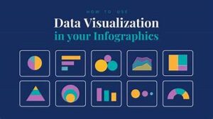
Effective visualization is crucial for interpreting and communicating descriptive statistics. Here are some key techniques:
1. Histograms
Histograms display the distribution of a dataset by showing the frequency of data points within specified ranges or bins. They are useful for understanding the shape and spread of the data, as well as identifying any skewness or gaps.
2. Box Plots
Box plots (or box-and-whisker plots) provide a visual summary of the data’s central tendency, variability, and skewness. They display the median, quartiles, and potential outliers, making them useful for comparing distributions between groups.
3. Pie Charts
Pie charts represent categorical data as segments of a circle, where each segment’s size corresponds to the proportion of the total. They are best suited for showing relative sizes of categories but are less effective for detailed comparisons.
4. Bar Charts
Bar charts display data with rectangular bars representing the frequency or value of categories. They are effective for comparing different groups or categories and can be oriented either vertically or horizontally.
5. Scatter Plots
Scatter plots show the relationship between two quantitative variables. Each point represents a data pair, and patterns or correlations can be identified through the distribution of points. Scatter plots are essential for exploring potential relationships and trends.
Applications in 2024
In 2024, the application of descriptive statistics is more relevant than ever due to the increasing volume and complexity of data across various fields:
- Business Analytics: Companies use descriptive statistics to analyze customer data, track performance metrics, and inform strategic decisions. Visualization tools like dashboards and charts help present data insights to stakeholders.
- Healthcare: Descriptive statistics are used to summarize patient data, track disease prevalence, and evaluate treatment outcomes. Effective visualization aids in communicating complex health data to both professionals and the public.
- Education: Educators and researchers apply descriptive statistics to analyze student performance, assess educational programs, and understand learning outcomes. Visualizations such as heat maps and progress charts are commonly used.
- Social Sciences: In fields like psychology and sociology, descriptive statistics help in summarizing survey results, analyzing behavioral patterns, and exploring social trends. Visual tools facilitate the communication of findings to broader audiences.
Conclusion
As we advance through 2024, the role of descriptive statistics in data analysis and visualization continues to be indispensable. Understanding and applying these essential techniques allows for effective summarization and interpretation of data, enabling better decision-making and insight generation across various domains. Whether you’re a data analyst, researcher, or business professional, mastering descriptive statistics and visualization techniques is crucial for navigating the complex data landscape of today

